Color Saturation In Home Design: Step-By-Step Guide For Your Next Home
- DreamDen AI Editorial Team
- Aug 30, 2024
- 5 min read

Updated: Aug 21, 2025
This post contains sponsored content, affiliate links, and or paid guest contributions. We value transparency and strive to follow FTC guidelines.
Color saturation plays a crucial role in interior design, influencing mood, atmosphere, and the overall visual impact of a room. It refers to the intensity or purity of a color, and knowing how to work with it can completely transform your space. Highly saturated colors bring energy and boldness, while softer, desaturated shades create calm and relaxation. This guide explains how to use color saturation in home design with practical tips, examples, and applications for every room.

Color saturation plays a crucial role in interior design, influencing the ambiance, mood, and visual impact of a space. It refers to the intensity or purity of a color, which can significantly affect how a room feels and looks. Understanding color saturation can help you make informed decisions about your home’s color scheme, leading to a more harmonious and visually appealing environment. This provides a versatile backdrop that can accommodate various accent colors with different saturations

What is Color Saturation?
Color saturation describes the depth and richness of a color. A highly saturated color is vivid and intense, while a desaturated color appears more muted and grayish. Saturation affects not only the color itself but also how it interacts with other elements in the room. For instance, a deep, saturated blue can create a dramatic effect, whereas a pastel blue offers a more subtle and serene atmosphere.
The Impact of Color Saturation on Room Design
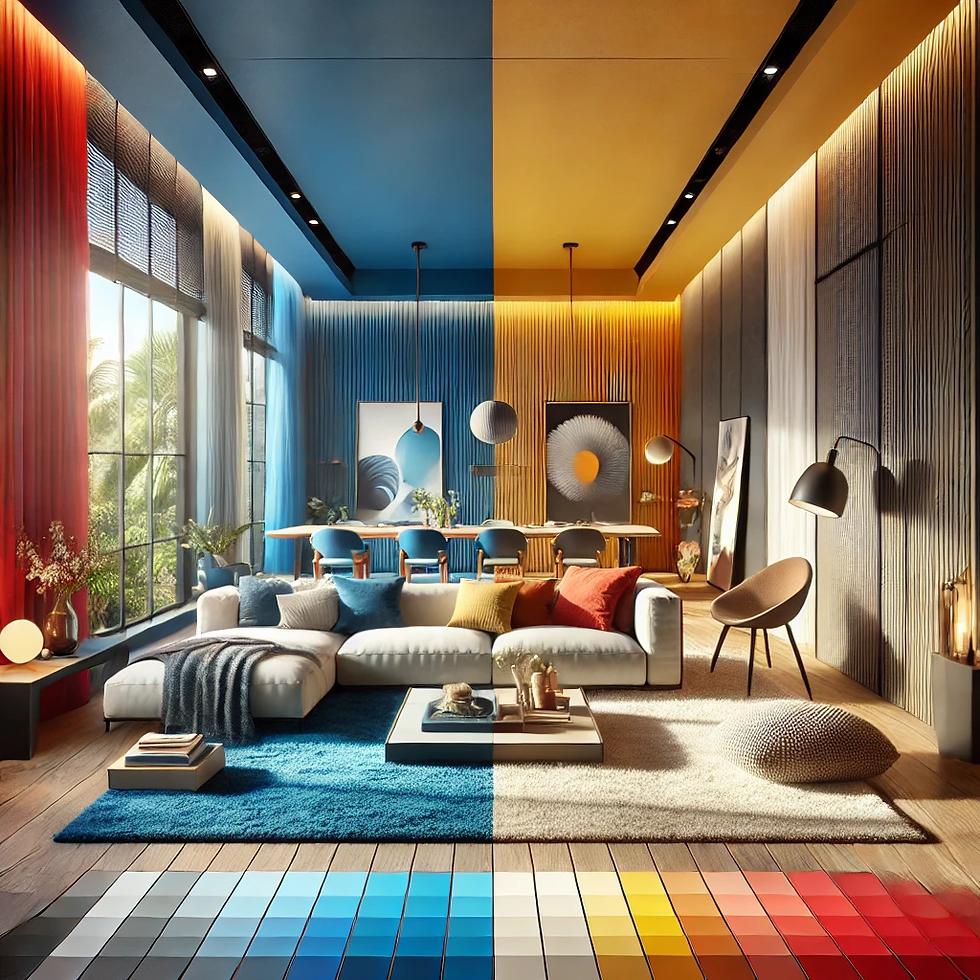
Creating Ambiance: Highly saturated colors, such as vibrant reds and bold blues, can energize a space, making it feel lively and dynamic. Conversely, desaturated colors like soft grays and muted pastels can create a calm, relaxed atmosphere. The saturation level you choose will set the tone for the room and influence its overall mood.
Focal Points and Accents: Saturated colors are often used as focal points or accent colors in a room. A richly colored feature wall or a set of vivid throw pillows can draw attention and add visual interest. In contrast, desaturated colors are typically used for larger areas, providing a neutral backdrop that allows accent colors to stand out.
Space Perception: The saturation of colors can affect the perception of space. Dark, saturated colors can make a room feel smaller and cozier, while lighter, desaturated colors can make a space feel larger and more open. This is particularly useful in smaller rooms where a lighter palette can help create a sense of expansiveness.
Complementing Other Elements: When selecting colors with varying saturation levels, consider how they will complement other design elements such as furniture, flooring, and lighting. A highly saturated color might clash with certain materials or create an overpowering effect if not balanced properly.
The Impact of Color Saturation on Room Design

Start with a Neutral Base: Begin with a neutral base color for walls and larger surfaces. This provides a versatile backdrop that can accommodate various accent colors with different saturations. To easily change background elements as needed. Neutral tones such as whites, grays, and beiges create a balanced foundation for experimenting with more saturated hues.
Balance Saturated and Desaturated Colors: Achieve visual harmony by balancing highly saturated colors with more muted tones. For example, pair a rich, emerald green with soft beige or white to prevent the space from feeling overwhelming. This combination ensures that the saturated colors stand out without dominating the room.
Consider Lighting: Lighting can significantly impact how colors appear in a room. Natural light, incandescent bulbs, and LED lights can alter the perception of color saturation. Test paint samples in different lighting conditions to see how they change throughout the day.
Use Saturation Strategically: Apply saturated colors to areas where you want to create a focal point or add a pop of interest. This could be a feature wall, a piece of artwork, or a set of colorful accessories. For less impactful areas, opt for more muted colors that complement the overall design without overpowering it.
Experiment with Color Schemes: Use color schemes to explore how different saturations interact. For instance, a monochromatic scheme with varying saturation levels of one color can create a cohesive look, while complementary schemes with contrasting saturations can add dynamic contrast.
Color Saturation Design Pricing Table
Design Element | Saturation Level | Price Range | Notes |
Wall Paint | High or low saturation | $30 – $60 per gallon | Deep tones (e.g., navy, emerald) often require primer or extra coats |
Accent Wall (Paint or Wallpaper) | Medium to high | $150 – $600+ | Paint is cheaper; wallpaper adds texture and bold impact |
Decor & Textiles | Cushions, curtains, rugs | $100 – $500 | Color-rich accessories add or balance saturation affordably |
Furniture (Bold Color) | Sofa, chair, bed frame | $300 – $2,000+ | Colorful furniture is a major investment in saturation design |
Lighting Effects | Colored LED, warm tones | $50 – $300+ | Adjustable lights enhance perceived color depth or saturation |
Practical Applications in Color Saturated Room Design

Living Rooms: In a living room, you might choose a deep, saturated color like navy blue for an accent wall and pair it with lighter, neutral furnishings. This creates a cozy yet sophisticated atmosphere where the accent color adds depth and richness.
Bedrooms: For a bedroom, consider using soft, desaturated colors like pastel greens or blues for walls and bedding. Incorporate a few bold, saturated accents through decorative items like cushions or throws to add personality without overwhelming the space.
Kitchens: In a kitchen, you could use a saturated color like bold yellow for cabinetry or an island, complemented by neutral walls and countertops. This creates a vibrant and cheerful space where the saturated color acts as a striking feature.
Bathrooms: For a bathroom, opt for soothing, desaturated colors like soft blues or grays for walls and tiles. Add a touch of luxury with saturated accents in accessories or artwork, creating a serene and stylish retreat.
FAQs
1. What is color saturation in design?
It’s the intensity of a color. Highly saturated colors are vivid and bold, while desaturated colors are muted and closer to gray.
2. How does color saturation affect mood?
Saturated colors energize a space, while desaturated shades create a calm and relaxed feel.
3. Can color saturation change how big a room looks?
Yes. Dark saturated tones make a room feel smaller and cozier, while lighter desaturated shades make it feel bigger and more open.
4. What are examples of saturated colors?
Rich emerald green, deep red, navy blue, or fuchsia.
5. How do I use saturated colors without overwhelming my space?
Use them in accents (pillows, rugs, art, feature walls) and balance them with neutral or muted tones.
6. Does lighting affect how saturation looks?
Absolutely. Different lighting (daylight, warm bulbs, LEDs) can make a color appear more vivid or more muted.
7. What’s the difference between saturation and brightness?
Saturation = color intensity. Brightness = how light or dark a color looks.
8. Can I mix saturated and desaturated colors in one room?
Yes. This creates balance and depth, as long as the combinations don’t clash.
9. How do I choose the right saturation level for my home?
Think about mood and room size. Use saturated tones for accents or energy, muted tones for calm and balance.
10. How can I test color saturation before painting?
Use swatches or paint samples in different lighting throughout the day to see how the saturation changes.
Conclusion
Color saturation is a powerful tool in interior design, shaping the mood and appearance of a room. By understanding and applying principles of color saturation room effectively, you can create spaces that are both aesthetically pleasing and functional. Whether you're aiming for a vibrant, energetic atmosphere or a calm, relaxing environment, thoughtful use of color saturation will help you achieve your desired design vision. Experiment with different levels of saturation, balance colors thoughtfully, and consider the impact of lighting to create a space that truly reflects desaturated palette interior design.


Comments