White Paint for Walls: How to Choose the Right Shade for Every Room
- DreamDen AI Editorial Team
- Jan 12
- 8 min read

You’ve decided to refresh your home. You want something clean, timeless, and bright. You think to yourself, "I’ll just paint the walls white. It’s the easiest choice, right?"
So, you walk into your local paint or hardware store, confident and ready. You approach the counter and ask for white paint. The clerk points to a wall of color chips. Suddenly, your confidence evaporates. You aren't looking at one color. You are looking at hundreds.
There’s Chantilly Lace, Swiss Coffee, Alabaster, Dove Wing, Pure White, Cloud White, and hundreds more. Some look yellow, some look blue, some look pink, and some look gray. Suddenly, the simplest choice in interior design feels like the most complicated.
Welcome to the world of white paint for walls.
But don't worry. This guide is designed to cut through the confusion. We are going to break down the science of undertones, explain exactly how lighting changes everything, and walk you through the best white paint for walls for every single room in your house.
Whether you are a seasoned renovator or a first-time homeowner, by the end of this guide, you will know exactly how to pick the perfect shade.
The Great Debate – Warm White vs. Cool White
Understanding the difference between warm white vs cool white is the most critical step in your decision-making process. The vibe of your room depends entirely on this choice.
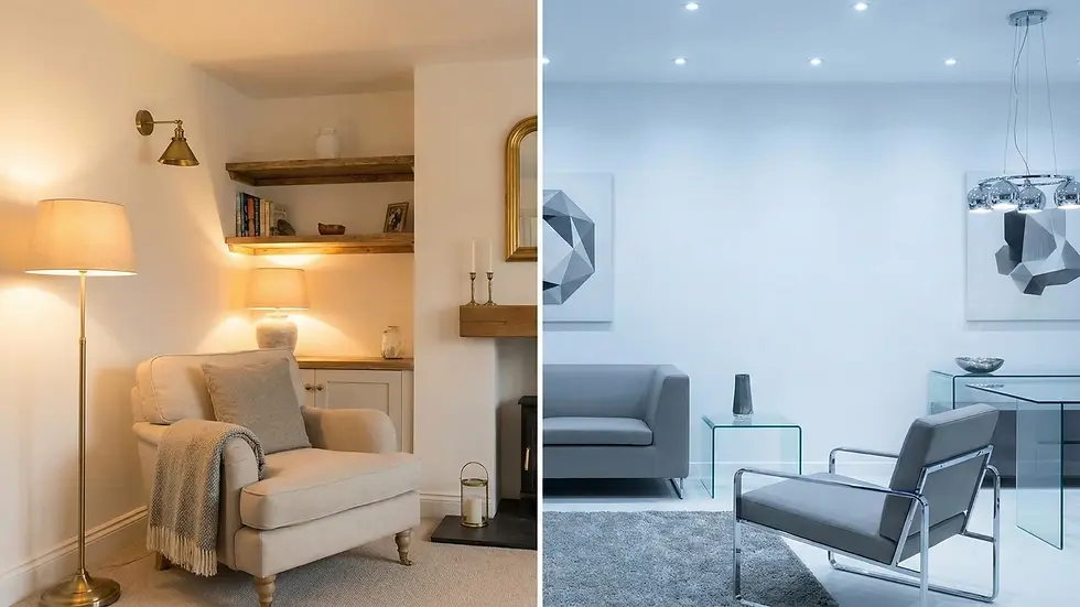
Warm White Shades

Warm whites have undertones of yellow, red, orange, or brown.
The Vibe: Cozy, inviting, traditional, soft, and comfortable.
Best Used When: You want to make a large room feel intimate, or you want to counter the coolness of a room that doesn't get much sunlight.
Pairs Well With: Natural wood tones, earthy colors (terracotta, olive green), brass or gold hardware, and traditional or farmhouse decor.
Common descriptors: Cream, Ivory, Vanilla, Linen, Off-White.
Why choose warm white? If you paint a room warm white, it feels like a hug. It softens the edges of a room. However, if you go too warm, the walls can look yellow or dingy, especially if the lighting isn't right.
Cool White Shades

Cool whites have undertones of blue, gray, green, or black.
The Vibe: Crisp, modern, airy, clean, and spacious.
Best Used When: You want to make a small room feel larger, or you are aiming for a minimalist, gallery-like aesthetic.
Pairs Well With: Concrete floors, marble, chrome or silver hardware, black accents, and bright, bold colors (like royal blue or bright red).
Common descriptors: Ice, Snow, Frost, Porcelain, Smoke.
Why choose cool white? Cool white is the darling of modern architecture. It makes spaces feel expansive and open. However, use caution: in a room with little light, cool white can feel sterile, gloomy, or "hospital-like."
The Secret Weapon – Lighting

You cannot choose the best white paint for walls without considering the direction your windows face. Natural light has its own color temperature, and it will drastically change how your white paint looks.
1. North-Facing Rooms

The Light: North light is soft, indirect, and distinctly cool/blue.
The Challenge: If you paint a North-facing room with a cool white (blue undertone), the room will feel icy and uninviting.
The Solution: You generally need a Warm White here. The yellow undertones in the paint will neutralize the blue light coming through the window, making the white look neutral and the room feel comfortable.
2. South-Facing Rooms

The Light: South light is intense, bright, and warm/golden.
The Challenge: This is the easiest light to work with. However, if you use a very creamy warm white, the intense sun might make the room look overtly yellow.
The Solution: You have options. Cool Whites look lovely here because the warm sun balances them out. Neutral Whites also work beautifully.
3. East-Facing Rooms

The Light: Bright and cool in the morning (sunrise), darker and warmer in the afternoon.
The Strategy: Think about when you use the room. If it’s a bedroom (morning use), the light will be cool, so a warmer white helps. If it’s a living room used in the evening, the light will be dimmer.
4. West-Facing Rooms

The Light: Dim in the morning, warm and golden in the late afternoon/evening.
The Strategy: This light can turn warm whites very orange during sunset. A neutral or slightly cooler white can help balance the intense "golden hour" light.
A Note on Artificial Lighting

Don't forget your lightbulbs
2700K Bulbs (Warm White): Will emphasize yellow undertones in paint.
3000K Bulbs (Soft White): A good middle ground.
4000K+ Bulbs (Daylight/Cool): Will emphasize blue/gray undertones.
Room-by-Room Guide to Choosing White Paint
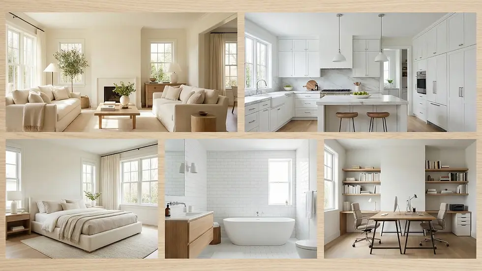
Now that we understand the theory, let’s apply it. Here is how to navigate choosing white paint for rooms throughout your house.
1. The Living Room

Goal: Welcoming, social, and flexible.
The living room is where you entertain guests and relax. You generally want this space to feel inviting.
Recommendation: Lean toward Warm Whites or Soft Neutral Whites.
Why: A stark, cool white can make a living room feel like a dentist's waiting room. A soft white (think "creamy" but not "yellow") provides a beautiful backdrop for art and furniture while keeping the vibe cozy.
Design Tip: If you have dark wood floors, a lighter, airier white helps contrast the heaviness of the floor. If you have light oak floors, a slightly warmer white creates a seamless, organic look.
2. The Kitchen

Goal: Clean, hygienic, and bright.
Kitchens are tricky because they usually have permanent fixtures like cabinets, countertops, and backsplashes that you have to coordinate with.
Recommendation: Neutral Whites or Off-Whites.
The Cabinet Dilemma: If you have white cabinets, do not try to match the wall paint exactly to the cabinets unless you are using the exact same paint code. If you miss by a little bit, one will look dirty next to the other.
Contrast is key: If cabinets are a bright cool white, go for a slightly darker off-white on the walls. If cabinets are creamy, go for a crisper white on the walls to modernize them.
The Finish: Use a satin or semi-gloss finish in the kitchen for easy cleaning of grease and splashes.
3. The Bedroom

Goal: Relaxing, serene, and soft.
This is your sanctuary. You want to avoid over-stimulation.
Recommendation: Warm Whites or "Complex" Whites.
Why: "Complex" whites have gray or beige undertones (greige). They aren't blindingly bright. When you wake up in the morning, you don't want a high-LRV (Light Reflectance Value) white stinging your eyes. You want a bedroom with a soft glow.
Design Tip: Avoid cool whites with blue undertones in the bedroom, as blue light can be perceived as colder and less cozy for sleeping environments.
4. The Bathroom
Goal: Flattering and clean.
Lighting is critical here, especially for shaving or applying makeup.
Recommendation: True Neutral White.
Why: You want to see your skin tone accurately. A white that is too yellow will make you look jaundiced; a white that is too green will make you look sickly. A bathroom wall paint that is neutral (neither too warm nor too cool) mimics daylight best.
Cleanliness: We associate white with hygiene. A crisp white in a bathroom feels sanitary.
5. The Home Office / Study

Goal: Focus and energy.
Recommendation: Cooler Whites or Crisp Neutrals.
Why: Warmer tones tend to induce relaxation (great for a living room, bad for a deadline). Cooler tones are associated with alertness and focus. A crisp white in your home office keeps the energy up and reduces eye strain by maximizing light reflection.
Understanding Paint Finishes (Sheen)

You’ve picked the color, but you aren't done yet. The "sheen"—how paint finishes affect interior design—changes how the color looks.
Flat/Matte: * Appearance: No shine, velvety.
Effect on White: Makes white look softer and richer. Hides wall imperfections.
Where to use: Ceilings, low-traffic bedrooms. (Hard to clean).
Eggshell:
Appearance: Very slight luster (like an eggshell).
Effect on White: The standard choice. Soft glow.
Where to use: Living rooms, hallways, dining rooms.
Satin:
Appearance: Noticeable glow.
Effect on White: Reflects more light, making the white appear brighter. See our satin white paint guide.
Where to use: Kitchens, bathrooms, high-traffic corridors.
Semi-Gloss/High-Gloss:
Appearance: Shiny and reflective.
Effect on White: Can make white look very intense. Highlights every bump in the wall.
Where to use: Trim, baseboards, doors, and cabinets.
Pro Tip: A common designer trick is to paint the walls White Shade A in an Eggshell finish, and the trim in the exact same White Shade A but in a Semi-Gloss finish. The difference in texture creates a subtle, sophisticated contrast without needing two different colors.
Common Mistakes to Avoid

Even with the best intentions, homeowners often fall into these traps when buying white wall paint shades.
Mistake 1: Buying Based on a Tiny Swatch
A 2-inch paint chip tells you almost nothing. When you paint an entire room, the color intensifies. A white with a "hint" of pink on the chip will look like a nursery room pink once it's on all four walls.
Fix: Buy a sample pot. Paint a large A4 card or a large patch on the wall.
Mistake 2: Ignoring the Flooring
Your flooring is the second largest surface in the room.
If you have red oak floors (warm), a cool white wall can clash and look blue.
If you have gray vinyl plank (cool), a yellow-cream wall will look dirty.
Fix: Hold your paint sample directly against the floor to check harmony.
Mistake 3: Painting the Ceiling "Ceiling White"
Many people buy a specific designer white for the walls and then grab a cheap, generic bucket labeled "Ceiling White" for the ceiling.
The Issue: Generic ceiling white is usually a cool, gray-toned white. If you have warm cream walls, the ceiling will look like a gray storm cloud is hovering over you.
Fix: Paint the ceiling the same white as the walls (in a flat finish), or choose a white that shares the same undertone.
Mistake 4: Not Checking the Paint at Night
You loved the color at noon on Saturday. But what about at 8 PM on Tuesday?
Fix: Check your sample patches in the morning, at noon, and at night with the lamps on.
Expert Tips for Styling White Walls

White walls are a blank canvas, but they can feel boring if not styled correctly. Here is how interior designers bring white rooms to life.
1. Texture is Everything
In a room without color, texture becomes the star. If you have white walls and a white sofa, you need texture to prevent it from looking flat. Think:
Chunky knit throws
Woven jute rugs
Velvet cushions
Rough wood accents
Linen curtains
2. The Power of Greenery
Nothing pops against a white wall like a houseplant. The chlorophyll green creates a vibrant, fresh contrast that stops a white room from feeling sterile.
3. Use Mirrors
White walls reflect light; mirrors double that effect. Placing a mirror opposite a window in a white room maximizes natural light, making even a tiny room feel grand.
4. Warm up with Metal
If your white walls feel too cold, add brass, gold, or copper accents. The warmth of the metal reflects off the white paint, adding a glow to the room.
Conclusion

Choosing the best white paint for walls is a journey, not a snap decision. It requires a little bit of patience and a willingness to test.
Remember the golden rules:
Identify the light: Does your room face North (cool) or South (warm)?
Pick your vibe: Do you want cozy (Warm White) or crisp (Cool White)?
Test before you commit: Never paint a room based on a chip you saw in the store. Paint a sample on the wall and live with it for 24 hours.
White is the most versatile color in the design spectrum. When you get the shade right, it doesn't just sit on the walls; it elevates everything else in the room, making your architecture crisper, your furniture more distinct, and your home brighter.
So go ahead, grab those samples, and find the shade that makes your house feel like home. Happy painting!


Comments