The Secret to Visual Interest: Using Texture Instead of Decor
- DreamDen AI Editorial Team
- Jan 28
- 12 min read

Are you tired of rooms that feel flat, cold, or just plain boring, even after you’ve filled them with expensive art and accessories? You’ve added color, you’ve bought the perfect furniture, but something is still missing. The space lacks visual interest in interior design, and your first instinct might be to buy more decor—more trinkets, more patterns, more clutter.
But what if the secret to a truly rich, layered, and sophisticated home wasn't about adding more things, but about adding more feel?
The most powerful tool in a designer’s arsenal is not color or pattern; it is texture in interior design. Texture is the quiet language of a room, the element that engages the senses and transforms a two-dimensional space into a three-dimensional experience. It is the difference between a house and a home.
In this comprehensive guide, we will show you how to master the art of layering textures to create depth, warmth, and contrast, allowing you to achieve a designer-level look without the clutter. We will explore the fundamental principles, provide practical, room-by-room examples, and give you the exact swaps you need to make to let texture do the heavy lifting in your home.
What is Texture in Interior Design?

Before we dive into the practical application, it is essential to understand the two distinct types of texture in interior design. Most people think of texture as something they can touch, but a skilled designer knows that texture is just as much about what you see.
Visual Texture vs. Tactile Texture
The term visual texture vs tactile texture defines the two ways we perceive a surface. Understanding this distinction is the foundation of successful layering.
Tactile Texture (The Feel)
Tactile texture refers to the physical surface quality of a material—how it feels when you touch it. This is the texture that engages your sense of touch and directly influences the perceived comfort and warmth of a space.
Examples of Tactile Texture:
Rough: Raw wood, natural stone, sisal, jute, chunky knit wool.
Smooth: Polished marble, glass, silk, high-gloss lacquer.
Soft: Velvet, boucle, faux fur, plush cotton.
Hard: Metal, concrete, ceramic tile.
Tactile texture is crucial for creating a sense of coziness and approachability. A room dominated by hard, smooth surfaces (like glass and polished metal) can feel cold, while a room rich in soft, rough textures (like linen and wool) feels instantly inviting.
Visual Texture (The Look)
Visual texture, on the other hand, is the illusion of texture. It is created by patterns, colors, and variations in light and shadow that make a surface look like it has a physical texture, even if it is perfectly smooth to the touch.
Examples of Visual Texture:
Wallpaper: A wallpaper printed with a faux linen weave or a distressed concrete pattern.
Paint Techniques: Venetian plaster or limewash paint, which create subtle variations in depth and color.
Natural Materials: The sweeping, intricate veining of marble or the knots and grain of wood.
Patterns: Geometric patterns on a rug or fabric that create a sense of rhythm and depth.
Visual texture is the element that adds complexity and depth to a room without requiring a physical change in the material. It is often used to break up large, flat surfaces like walls and floors.
Why Layered Textures Replace Clutter and Decor

The biggest mistake homeowners make when trying to add texture to a room is treating it as an afterthought—a throw pillow here, a rug there. In reality, texture should be the primary driver of visual interest in interior design, allowing you to simplify your decor without sacrificing sophistication.
When you master layered textures, you no longer need dozens of small accessories to fill a void. The materials themselves become the decoration.
Depth, Light, and Shadow
Texture’s power lies in its interaction with light. A smooth, glossy surface reflects light evenly, which can make a room feel bright but flat. A rough, matte, or heavily textured surface, however, absorbs and scatters light, creating subtle shadows and highlights.
Example: Consider a wall covered in smooth, flat paint versus a wall finished with Venetian plaster. The plaster’s subtle irregularities catch the light differently throughout the day, creating micro-movement and depth that a flat wall simply cannot achieve. This dynamic interplay of light and shadow adds complexity and sophistication without a single piece of art.
The Power of Contrast
Texture is the ultimate tool for creating contrast, especially in neutral or monochromatic color schemes. When you use a limited color palette (like whites, creams, and beiges), the room can quickly become monotonous. Texture prevents this by introducing variety where color does not.
Example: A white room featuring a smooth, white leather sofa, a chunky white wool rug, a matte white ceramic vase, and sheer white linen curtains is far more interesting than a white room where every surface is the same smooth drywall. The contrast between the materials—hard vs. soft, matte vs. sheer—creates a rich, layered look that is anything but boring. This is the secret to successful texture for neutral interiors.
5 Designer-Style Rules for Mixing Textures
Mastering the art of mixing textures requires a strategic approach. These five rules, used by professional designers, will ensure your layers feel intentional and harmonious, not chaotic.
Rule 1: The Rule of Three (Soft, Hard, and Smooth)
To ensure a room feels balanced and engaging, aim to incorporate at least three contrasting texture types in any single vignette or area. A common formula is:
One Soft/Rough Texture: (e.g., Boucle, chunky knit, raw wood, linen)
One Hard/Reflective Texture: (e.g., Polished metal, glass, mirror, high-gloss lacquer)
One Smooth/Honed Texture: (e.g., Honed stone, smooth leather, matte ceramic)
Practical Application: On a sofa, don't use three identical cotton pillows. Instead, pair a smooth velvet pillow (Soft), a woven linen pillow (Rough), and a small, metallic leather pillow (Hard/Reflective).
Rule 2: Mix Reflectivity: Matte vs. Glossy Textures
One of the easiest ways to add texture to a room is by playing with the way materials reflect light. The contrast between matte vs glossy textures creates instant dimension.
Matte Finishes: Absorb light and provide a grounding, calming effect (e.g., honed marble, chalk paint, unpolished wood).
Glossy Finishes: Reflect light and add energy, drama, and a sense of luxury (e.g., polished brass, lacquered cabinets, smoky glass).
Practical Application: If your walls are painted with a flat, matte finish, introduce a high-gloss ceramic lamp or a polished chrome side table. If your kitchen cabinets are glossy, use a matte, textured tile backsplash to balance the light.
Rule 3: Embrace Irregularity and the Handcrafted
Perfection is often boring. Handcrafted pieces introduce subtle imperfections and irregularities that add "soul" and depth to a space. These subtle variations catch light differently and keep a room from feeling overly manufactured.
Examples: Hand-thrown pottery, woven baskets, carved wood accents, or zellige tiles (which have slight variations in color and shape). These elements introduce a tactile roughness that grounds a room.
Rule 4: The 80/20 Principle (Base vs. Accent)
When layering, 80% of your textures should be the base—large, calming, and consistent (e.g., smooth walls, soft rug, simple sofa fabric). The remaining 20% should be the accent—small, high-contrast, and dramatic (e.g., a metallic thread in a pillow, a deeply ribbed vase, a rough-hewn wooden bowl). This principle ensures that your room feels cohesive and calm, while the accent textures provide the necessary pop of visual interest in interior design.
Rule 5: Vary the Scale of Texture
Just as you vary the scale of patterns, you must vary the scale of texture.
Large-Scale Texture: A chunky, oversized knit throw or a large, deeply carved wooden headboard.
Fine-Scale Texture: A smooth silk pillow, a tightly woven linen, or a finely ribbed glass vase. By combining a large-scale texture with several fine-scale textures, you create a visual hierarchy that guides the eye through the space.
Room-by-Room: How to Add Texture to a Room

Texture should be integrated into every room, but the application changes based on the room’s function and the materials already present.
The Living Room: The Textile Trifecta

The living room is the easiest place to master layered textures because it is dominated by textiles.
Element | Material/Texture | Why it Works |
Sofa | Boucle, Linen, or Textured Weave | Provides a soft, inviting base that is inherently textured. |
Rug | Jute, Sisal, or High-Low Pile Wool | Grounds the room with a rough, natural texture that contrasts with smooth flooring. Check our carpet calculator for sizing. |
Throws | Chunky Knit Wool or Faux Fur | Adds a large-scale, soft, and tactile layer that invites touch. |
Walls | Limewash Paint or Grasscloth Wallpaper | Adds subtle visual texture and depth, preventing flat walls. |
Accents | Polished Brass or Ribbed Ceramic | Introduces hard, reflective contrast against the soft textiles. |
Tip: Use layered rugs—a large, smooth sisal rug underneath a smaller, softer patterned rug—to instantly double the depth.
The Bedroom: Sanctuary of Softness

The bedroom should prioritize tactile textures that promote relaxation and comfort.
Bedding: Start with high-thread-count cotton or linen (smooth/soft). Layer with a chunky, weighted blanket or a velvet quilt (soft/rough).
Headboard: Opt for a headboard in a textured material like woven rattan, tufted velvet, or deeply carved wood. This is a large, permanent piece of texture that anchors the room.
Window Treatments: Combine sheer linen curtains (light, fine texture) with heavy, blackout velvet drapes (heavy, soft texture) for both function and visual depth.
Flooring: A plush, high-pile rug underfoot is essential for tactile comfort when stepping out of bed.
The Kitchen: Hard Surfaces with Subtle Detail

The kitchen is dominated by hard, smooth surfaces (cabinets, countertops), making it crucial to introduce texture through subtle details.
Backsplash: Instead of a plain subway tile, use a handmade zellige tile, a vertically stacked fluted tile, or a stone with a heavily honed or leathered finish.
Cabinetry: If you have flat-front cabinets, consider adding texture with reeded glass inserts or fluted wood panels on the island or pantry doors.
Countertops: A honed (matte) marble or granite is often more texturally interesting than a polished (glossy) one, as it absorbs light and shows the natural grain more subtly.
Accents: Use matte black hardware, woven rattan bar stools, and rough-hewn wooden cutting boards left out on display.
The Bathroom: Water, Stone, and Plushness

The bathroom is another area where hard surfaces dominate.
Walls: Use a textured wall covering like Tadelakt plaster or a heavily textured porcelain tile that mimics stone.
Vanity: A vanity with a slatted wood front or a stone sink bowl (instead of porcelain) adds a natural, rough element.
Textiles: Invest in thick, plush cotton or Turkish towels. The difference between a thin, smooth towel and a thick, textured one is immense in terms of tactile comfort and visual weight.
Accents: Use ribbed glass shower doors or a simple wooden stool to hold bath products.
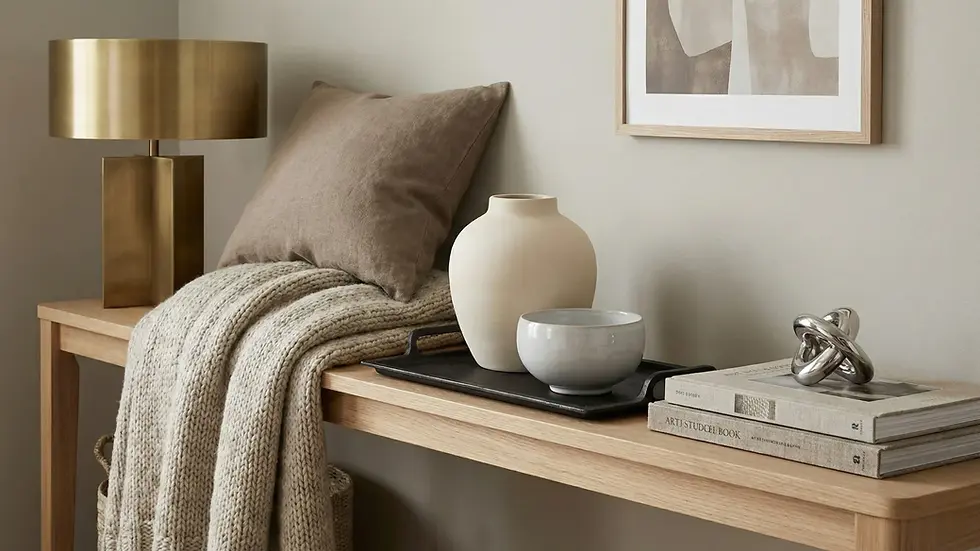
The Hallway: The First Impression

The hallway is often neglected, but it is the first opportunity to add texture to a room and set the tone for the rest of the home.
Walls: Grasscloth or sisal wallpaper is a fantastic way to introduce a large-scale, natural texture that instantly adds warmth.
Flooring: A runner with a high-low pile or a bold, woven pattern adds visual interest and comfort.
Console: Use a console table made of raw, reclaimed wood or a hammered metal finish, topped with a smooth, matte ceramic bowl.
Texture Swaps: Replacing Decor with Materiality
The goal is to stop buying small, disposable decor items and start investing in materials that are inherently beautiful and textured. Here are key swaps to make in your home:
Instead of Buying... | Swap for This Textured Material... | Effect |
A Gallery Wall of Small Prints | A Wall Finished in Venetian Plaster or Limewash | Replaces visual clutter with subtle, dynamic visual texture and depth. |
A Generic Glass Vase | A Ribbed, Matte Ceramic or Hand-Thrown Pottery Vase | Replaces smooth, reflective surface with a tactile, irregular accent that catches light. |
A Plain Painted Kitchen Island | Fluted or Reeded Wood Paneling | Adds architectural texture and shadow lines, making the island a focal point. |
A Thin, Smooth Area Rug | A High-Pile Wool or Natural Jute Rug | Increases tactile comfort and provides a rough contrast to smooth floors. |
A Plastic Soap Dispenser | A Honed Stone or Textured Concrete Dispenser | Elevates a mundane item with a hard, natural texture. |
A Smooth Cotton Throw | A Chunky Knit or Boucle Throw | Provides large-scale, soft texture that is instantly inviting and luxurious. |
A Standard Coffee Table | A Live-Edge Wood or Hammered Metal Table | The material itself becomes the decor, showcasing natural irregularity. |
Common Texture Mistakes and Quick Fixes
Even with the best intentions, it is easy to make mistakes when mixing textures. Here are the most common pitfalls and how to fix them.
Mistake 1: Texture Overload (The "Mishmash" Effect)
The Problem: You’ve introduced too many competing textures—chunky knit, velvet, rattan, metal, and rough wood—all fighting for attention in one small area. The room feels busy, chaotic, and visually exhausting.
The Fix: Revert to the 80/20 Principle. Pull back 80% of the accent textures and ensure they share a common color or tone. For example, if you are using a neutral palette, ensure all your rough textures (jute, raw wood) are in the same warm beige family, and all your smooth textures (metal, glass) are in the same cool silver family. This cohesion allows the textures to complement, not compete.
Mistake 2: Ignoring Light and Shadow
The Problem: You have beautiful textures, but the room is poorly lit, either too dark or with harsh, overhead lighting. Texture relies on light and shadow to be visible; without it, your expensive plaster wall looks flat.
The Fix: Introduce layered lighting. Use accent lighting (spotlights, picture lights) to graze textured walls, highlighting the subtle irregularities. Use table lamps and floor lamps at different heights to create pools of light and shadow, which naturally emphasize the depth of your layered textures.
Mistake 3: Texture for Neutral Interiors is Too Safe
The Problem: You’ve successfully used texture for neutral interiors, but the result is still a bit bland. You’ve used all soft, fine textures (smooth cotton, fine linen, matte paint) and avoided any high-contrast elements.
The Fix: Introduce one or two high-contrast, hard textures. If your room is all soft beige linen and wool, add a piece of furniture with a high-gloss lacquer finish or a piece of art with a hammered metal frame. The sharp contrast between the soft and the hard will instantly elevate the entire space and provide the necessary visual interest in interior design.
Mistake 4: Forgetting the Vertical Plane
The Problem: You’ve focused all your texture on the floor (rugs) and furniture (pillows/throws) but left the walls and ceiling flat.
The Fix: Look up! The walls and ceiling are the largest surfaces in the room. Consider adding texture through:
Wall Treatments: Grasscloth, wood slatting, or a textured wallpaper.
Window Treatments: Layered drapes (sheer + heavy).
Ceiling: Exposed beams, tongue-and-groove paneling, or a textured plaster finish. Introducing texture in these unexpected places creates an outsized impact.
Your Quick Texture Audit Checklist

Use this checklist to quickly assess where you can add texture to a room and improve your layering strategy.
Foundation: Is the largest surface (rug or flooring) a contrasting texture to the walls?
The Rule of Three: Can you identify at least three distinct texture types (Soft, Hard, Smooth) in your main seating area?
Reflectivity: Do you have a balance of matte and glossy finishes? (e.g., a matte sofa next to a glossy side table).
Vertical Plane: Have you added texture to the walls (wallpaper, plaster, wood)?
Handcrafted Element: Do you have at least one piece of handcrafted pottery, carved wood, or artisanal textile?
Contrast: In your neutral areas, is there enough contrast between the softest and hardest materials?
Lighting: Does your lighting scheme create shadows that highlight the texture of your walls and materials?
Conclusion: The Quiet Language of Design

Texture is the unsung hero of interior design. It is the element that transforms a collection of objects into a cohesive, sensory experience. By shifting your focus from accumulating decorative items to strategically layering materials—from the rough weave of a jute rug to the subtle sheen of a velvet pillow—you can achieve a level of depth and sophistication that no amount of clutter can replicate.
Stop searching for the perfect trinket to fill that empty corner. Instead, look at the materials you already have and ask yourself: How can I introduce a contrasting texture here?
Ready to see how your favorite textures will look in your space? Use DreamDen.ai’s powerful AI visualization tool to upload a photo of your room and instantly swap out materials—from Venetian plaster walls to chunky boucle sofas—before you commit to a single purchase.
Frequently Asked Questions (FAQs)
Q1: How much texture is too much texture?
There is no fixed limit, but the room should feel balanced, not busy. A good rule of thumb is to ensure that your textures are unified by a single, limited color palette. If you are using many different textures and many different colors, the room will likely feel chaotic. When in doubt, simplify the color and let the textures do the work.
Q2: Does pattern count as texture?
Pattern is a form of visual texture, but it is not a substitute for tactile texture. A patterned fabric that is smooth to the touch provides visual interest but lacks the depth and sensory engagement of a material with physical relief, like a chunky wool or rough linen. The best rooms combine both: a patterned rug (visual texture) made of high-pile wool (tactile texture).
Q3: How can I add texture to a room without buying new furniture?
Focus on textiles and accessories. This is the easiest and most affordable way to add texture to a room.
Throws and Pillows: Swap out smooth cotton for chunky knits, velvet, or linen.
Rugs: Layer a small, high-pile rug over your existing carpet or hard floor.
Window Treatments: Add sheer linen panels behind your existing drapes.
Accessories: Replace smooth plastic or glass vases with matte ceramic, stone, or woven baskets.
Q4: Is texture more important than color in interior design?
In a modern context, yes. Color sets the mood, but texture in interior design creates the depth and sophistication. A monochromatic room (all white, all gray) can be incredibly rich and interesting if the textures are varied (smooth marble, rough linen, soft velvet). A room with many colors but only smooth surfaces will always feel flat. Texture is the element that makes a space feel expensive and layered.
Q5: How do I use texture for neutral interiors without making them boring?
The key to successful texture for neutral interiors is maximizing contrast. Use a wide range of materials:
Rough vs. Smooth: Pair raw, reclaimed wood with polished, smooth glass.
Matte vs. Glossy: Use matte plaster walls with high-gloss lacquered furniture.
Natural vs. Man-made: Combine soft linen and wool with hard, cool metals and concrete.


Comments