Lithographs in Modern Interior Design: Why They're Trending in 2026
- DreamDen AI Editorial Team
- Dec 31, 2025
- 12 min read

Updated: Apr 6
In the ever-evolving world of interior design, trends are often reactions to the status quo. For the last decade, our walls have been dominated by high-resolution digital prints, gallery-wrapped canvases of stock photography, and the sleek, flat aesthetic of "fast art." But as we move further into the mid-2020s, a palpable shift is occurring. Homeowners, collectors, and top-tier designers are experiencing a collective digital fatigue. There is a growing craving for the authentic, the tactile, and the historically significant. Enter the lithograph.
Once the primary method for mass-producing images in the 19th century, the lithograph has returned to the forefront of the design conversation. But this isn't just about nostalgia; it is about a sophisticated appreciation for craft. Lithographs in modern interior design offer a bridge between the exclusive world of original oil paintings and the accessible realm of reproduction. They possess a depth, a texture, and a "hand" that digital giclée prints simply cannot replicate.
Whether you are a seasoned collector looking to diversify your assets or a design enthusiast wanting to elevate your living room with something more meaningful than a poster, understanding the resurgence of lithographs is key. In this comprehensive guide, we will explore the technical mastery behind the medium, why it perfectly aligns with the modern interior design guide for 2026, and how you can style these timeless pieces in a contemporary home.
What Are Lithographs in Modern Interior Design? A Deep Dive into the Medium

To truly understand the value of lithographs in modern interior design, one must first strip away the confusion that often surrounds the term. In the marketplace, "lithograph" is sometimes used loosely to describe any poster, but a true lithograph is a specific, labor-intensive form of printmaking that dates back to 1796.
The Origins of an Accidental Masterpiece

The medium was invented almost by accident by a German author named Alois Senefelder. Seeking a cheaper way to publish his theatrical plays, Senefelder discovered that Bavarian limestone retained grease marks and repelled water. This discovery birthed "stone printing" or lithography (from the Greek lithos, meaning stone, and graphein, meaning to write). Unlike etching or woodcutting, which require cutting into a surface, lithography is planographic—meaning the printing surface is completely flat.
The Chemistry of Art

The process relies on the simple chemical principle that oil and water do not mix. Here is the breakdown of how a traditional lithograph is born, a process that adds to its allure in lithographs in modern interior design:
The Drawing: An artist draws directly onto a slab of limestone (or a zinc/aluminum plate) using a greasy crayon or ink called tusche. This is the first "human" element—every mark on the stone is the artist's actual stroke.
The Etch: The stone is treated with a mixture of gum arabic and nitric acid. This chemical solution "fixes" the greasy image into the stone and desensitizes the non-image areas, making them water-receptive.
The Wash: The original drawing material is wiped away, leaving only a chemical ghost of the image. The stone is then kept wet with water.
The Inking: Oil-based ink is rolled over the stone. Because water repels oil, the ink adheres only to the chemical image and is repelled by the wet, blank areas of the stone.
The Press: Paper is placed over the stone, and it is run through a high-pressure press. The result is a mirrored transfer of the artist's drawing.
Why This Process Matters for Interiors

Why should a modern homeowner care about 18th-century chemistry? Because the process dictates the aesthetic. Stone lithography allows for soft, granular textures and rich, velvety blacks that digital printing cannot achieve. When we talk about lithographs in modern interior design, we are talking about bringing this unique visual weight into a room. A lithograph has a physical presence; the ink sits in and on the paper in a way that feels organic. In a modern home often filled with smooth surfaces—glass, steel, polished concrete—the subtle, organic imperfection of a lithograph provides a necessary soulful counterpoint.
The 2026 Trend Forecast: The Role of Lithographs in Modern Interior Design

As we look toward the design trends of 2026 and beyond, several key movements are converging to make this the "Year of the Lithograph." The sterile minimalism of the early 2010s is dead, replaced by "Warm Minimalism," Maximalist Eclectic, and a general move toward "Lived-in Luxury." Here is why lithographs in modern interior design are the perfect protagonist for this new narrative.
1. The Shift to "Tactile" Living

The biggest buzzword for the upcoming design season is tactility. We are seeing a resurgence of bouclé fabrics, raw wood, limewash walls, and hand-thrown ceramics. We want our homes to feel touchable. Flat, glossy digital prints feel disconnected in these environments. A lithograph, especially one printed on high-quality Arches or Rives BFK paper, has a texture that resonates with this trend. The ink has a matte quality that absorbs light rather than reflecting it, creating a softness that complements textured walls and organic fabrics.
2. The Quest for Authenticity and "The Hand of the Artist"

In an era of AI-generated art and mass production, the "human touch" has become a luxury commodity. Homeowners are increasingly asking, "Who made this?" A lithograph answers this question powerfully. Because the artist often draws directly on the plate or stone, a lithograph captures the spontaneity of their sketch. When you hang a lithograph by a mid-century master or a contemporary artist, you are hanging a record of their physical movement. This authenticity anchors a room, giving it a sense of history and gravitas that a generic canvas cannot provide.
3. Sustainability and the Vintage Revival

Sustainability is no longer a niche preference; it is a driving force in design. The most sustainable item you can buy is one that already exists. This has fueled a massive boom in the vintage market. Vintage lithographs in modern interior design—posters from the 1960s, exhibition prints from the 70s, or fine art editions from the 80s—allow designers to recycle high culture. Instead of buying a mass-produced print that will end up in a landfill in five years, collectors are hunting for vintage lithographs that hold their value and have survived decades. It is eco-conscious decorating that doubles as investment.
4. "Quiet Luxury" and Intellectual Signaling

The "Quiet Luxury" trend (often associated with fashion brands like Loro Piana or The Row) has migrated to interiors. It is about understated quality that whispers rather than shouts. A screaming neon sign is "loud luxury." A signed, limited-edition lithograph by Ellsworth Kelly or Helen Frankenthaler is "quiet luxury." It signals intellectual depth and cultural awareness. Including lithographs in modern interior design schemes suggests that the homeowner is a curator of their life, valuing provenance and artistry over mere decoration.
Comparing Art Mediums: Why Choose Lithographs in Modern Interior Design Over Digital Prints?

For the aspiring collector or the savvy decorator, distinguishing between a lithograph and a standard offset or digital print is crucial. It dictates the price, the aesthetic value, and the longevity of the piece. Here is a comparative guide to help you understand why prioritizing lithographs in modern interior design is a superior choice.
The Visual Difference: The Magnifying Glass Test

The most practical way to spot the difference is to get up close—very up close.
Offset/Digital Prints: If you look at a magazine page or a standard poster under a magnifying glass, you will see a uniform pattern of tiny dots (Cyan, Magenta, Yellow, Black) arranged in neat rows. This is the "rosette" pattern of mechanical reproduction. It creates a flat image where colors mix optically.
Lithographs: A true stone or plate lithograph will not have this mechanical grid. Instead, you will see a random, organic pattern of grain. The "dots" are irregular, created by the tooth of the stone. The colors are often solid patches of ink rather than a mix of tiny dots. This "random grain" gives the image a richer, more painterly vibration.
Depth of Color and Light Absorption

Digital prints sit on top of the paper, often with a slight sheen from the binding agent in the toner or ink. Lithographic ink, however, soaks into the fibers of the paper. This creates a velvety, matte finish. In lithographs in modern interior design, this is vital for lighting. You can light a lithograph more dramatically without getting the harsh glare you might get from a glossy digital print. The blacks in a lithograph (especially by artists like Richard Serra or Robert Motherwell) are abyssal and profound, anchoring a wall in a way digital black ink—which is often just a dark grey—cannot.
Value and Scarcity

Digital Prints: usually "Open Edition," meaning they can be printed infinitely. They have little to no resale value.
Lithographs: Usually "Limited Edition." You will often see a fraction in the corner (e.g., 25/100). Once those 100 are printed, the stone is often ground down or the plate destroyed, ensuring no more can be made. This scarcity is what drives investment potential. Incorporating lithographs in modern interior design is not just an aesthetic expense; it is an asset acquisition. A signed lithograph by a blue-chip artist can appreciate in value, whereas a digital reproduction almost certainly will not.
The "Original Print" Distinction

It is important to note the concept of the "Original Print." In the art world, a painting is a unique original. A photo of that painting is a reproduction. But a lithograph is considered an "original print" if the artist intended to create it as a lithograph. It is not a copy of a painting; it is a work of art conceived for the medium. This distinction is why lithographs in modern interior design carry the weight of "fine art" rather than "decor."
Master Class: Styling Lithographs in Modern Interior Design for Every Room

Now that we have established the value and the "why," let’s move to the "how." Styling lithographs in modern interior design requires a nuanced approach. Because these pieces have a strong presence, they need to be placed thoughtfully. Here is a room-by-room guide to integrating them into your home.
The Living Room: The Conversation Anchor
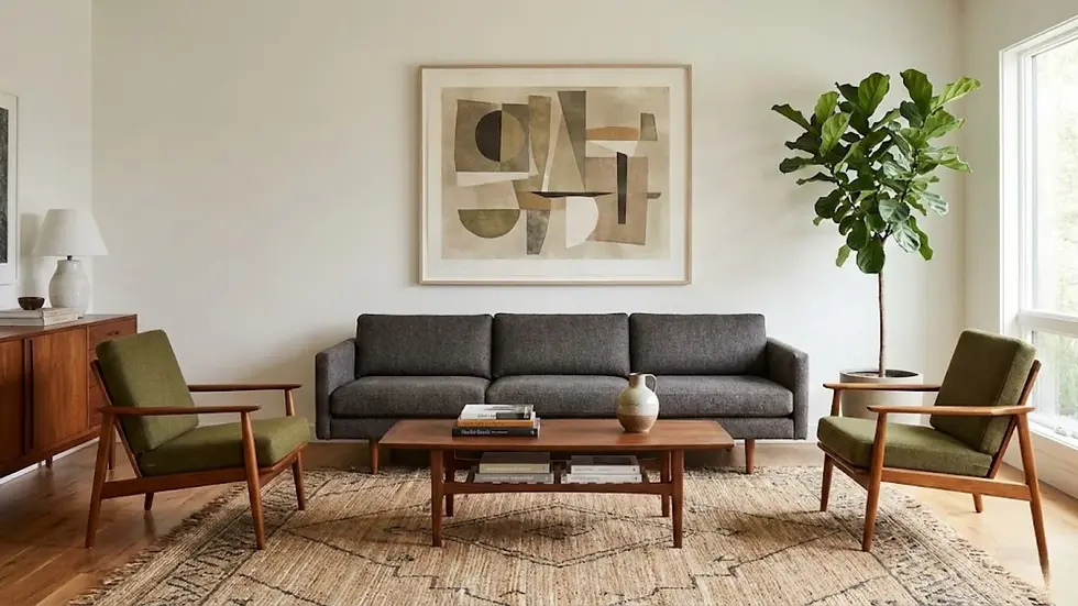
In the living room, art serves as the focal point. Avoid the temptation to clutter the room with many small pieces.
The Strategy: Go big. A single, large-scale lithograph can define the entire color palette of the room.
The Style Pairing:
Mid-Century Modern: Look for abstract expressionist lithographs (think Motherwell or Kline). Their bold black gestures cut through the warmth of teak furniture and walnut sideboards, adding a necessary edge.
Japandi/Organic Modern: Choose lithographs with subtle, wash-like qualities or botanical themes (think Ellsworth Kelly’s plant drawings). Frame them in light oak or maple to maintain the serene, monochromatic palette.
Maximalist: Use a large, colorful exhibition poster lithograph (like a vintage Picasso or Matisse exhibition poster) as the center of a gallery wall, surrounded by smaller, disparate objects.
The Home Office: Intellectual Depth

The home office is a place for focus and inspiration. The art here should reflect your aspirations and intellect.
The Strategy: Constructivism and Geometry.
The Style Pairing:
Industrial Modern: A Russian Constructivist or Bauhaus-style lithograph (think El Lissitzky or Kandinsky) works perfectly here. The sharp angles and geometric precision mirror the structure of thought and work. The matte quality of the lithograph softens the often cold materials of desks and monitors.
Placement: Hang a medium-sized piece visible from your desk chair (for your enjoyment) or directly behind you (to create a sophisticated Zoom backdrop).
The Bedroom: Serenity and Softness

The bedroom demands a lower-energy atmosphere.
The Strategy: Soft hues and landscapes.
The Style Pairing:
Soft Minimalist: Look for color-field lithographs (like Helen Frankenthaler or Mark Rothko). The way lithographic ink bleeds into paper mimics watercolor, creating a soothing, dreamlike effect perfect for relaxation.
Framing Tip: Avoid heavy black frames in the bedroom. Opt for "floating" mounts in white or natural wood shadow boxes. This makes the artwork feel lighter and airier, contributing to the restful vibe.
The Dining Room: The Captive Audience

In a dining room, your guests are seated and have time to truly look at the art. This is the place for detail.
The Strategy: Intricacy and Series.
The Style Pairing:
The Triptych: Lithographs often come in suites or series. Hanging a set of three related lithographs (a triptych) horizontally across a sideboard or buffet creates a rhythm that guides the eye.
Subject Matter: Figurative work or still lifes (David Hockney or Wayne Thiebaud) work well here. They provide subject matter for dinner conversation without being overly aggressive or political, which can disrupt the meal’s atmosphere.
Framing Trends for 2026

How you frame lithographs in modern interior design is just as important as the art itself. The trend for 2026 is "Archival Visibility."
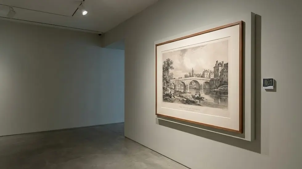
Float Mounting: This is the gold standard. The lithograph is hinged to a backing board so that the edges of the paper are visible. This shows off the "deckle edge" (the rough, torn edge of high-quality paper), emphasizing the tactile nature of the object.
Wood over Metal: We are seeing a move away from the thin black aluminum frames of the 2010s toward substantial wood profiles—walnut, cherry, and white oak. The warmth of the wood complements the organic grain of the lithograph stone.
Oversized Mats: A small lithograph in a huge frame with an exaggerated 6-inch or 8-inch mat is a major trend. It turns a small, affordable piece into a major architectural statement.
Care and Preservation: Protecting Your Lithographs in Modern Interior Design
When you incorporate lithographs in modern interior design, you are acting as a custodian of history. Unlike a digital print that can be re-downloaded and re-printed, a damaged lithograph is often lost forever. Preserving these works requires specific environmental considerations.
1. The Enemy: Ultraviolet Light
Lithographic inks, while generally more stable than watercolor, are still susceptible to fading, particularly the reds and yellows.
The Rule: Never hang a lithograph in direct, striking sunlight. Even a few hours a day can wash out a print in a year.
The Solution: If your modern home is filled with floor-to-ceiling windows (as many are), you must use UV-filtering glass or acrylic (Plexiglas). Museum Glass® or Optium Museum Acrylic® blocks 99% of UV rays and is virtually invisible, reducing reflection so you can see the texture of the print. (For homes with intense exposure, consider studying how natural light affects different exposures to choose the safest wall).
2. Humidity and the "Ripple"
Paper is hygroscopic—it absorbs and releases moisture from the air. In a modern home, fluctuations in humidity (from AC to open windows) can cause the paper to buckle or "cockle."
The Fix: This is another reason for the "hinge mount" or "float mount." By only attaching the art at the top corners, the paper is free to expand and contract with the seasons without buckling against the frame.
Avoid: Never hang a valuable lithograph in a bathroom. The humidity spikes are too violent for the paper fibers to handle long-term.
3. Acid Burn
If you are buying a vintage lithograph that is already framed, be wary. Older frames often used acidic cardboard backing or mats. Over time, this acid leaches into the print, turning the paper brown and brittle (a process called "mat burn").
The Upgrade: When you acquire a new piece, take it to a professional framer immediately. Ask them to replace all internal materials with "conservation grade" or "museum quality" acid-free mats and backing boards. This is the single best thing you can do to ensure the longevity of lithographs in modern interior design.
Future Predictions: The Enduring Appeal of Lithographs in Modern Interior Design

As we forecast the trajectory of interior design through the late 2020s, the role of the lithograph appears robust. We are heading toward a "Phygital" world—a blend of physical and digital. As our homes become "smarter," filled with voice assistants, smart screens, and automated lighting, the need for physical anchors will only grow.
This is where the synergy between advanced technology and heritage art becomes practical. Platforms like DreamDen.ai are redefining this selection process. By utilizing AI to visualize how a specific lithograph interacts with your room's lighting and layout, you can merge digital precision with analog soul. It allows homeowners to experiment with the scale and placement of these historical pieces virtually, ensuring they harmonize with modern interiors before a purchase is made.
We predict a rise in the "Slow Collecting" movement. Just as "Slow Food" championed local, sustainable ingredients, "Slow Collecting" will champion the acquisition of fewer, better things. Lithographs in modern interior design fit this ethos perfectly. They require patience to find, knowledge to select, and care to maintain.
Furthermore, as the prices of original canvases by blue-chip artists continue to skyrocket into the stratosphere, lithographs will remain the democratization of the art market. They allow a young professional or a new family to own a piece of the art history canon—a Miro, a Chagall, a Calder—without needing a billionaire’s budget.
The future of interiors is not about perfection; it is about personality. It is about the story your home tells. A digital print says, "I filled a space." A lithograph says, "I chose this." In the landscape of modern design, that distinction makes all the difference.
Conclusion

The comeback of the lithograph is more than just a fleeting trend; it is a correction. It is a return to material substance in an increasingly immaterial world. By choosing to incorporate lithographs in modern interior design, you are adding layers of history, chemistry, and artistry to your space. You are choosing texture over flatness, depth over surface, and the hand of the artist over the algorithm of the machine.
Whether you start with a small, unsigned vintage exhibition poster or invest in a large-scale, signed limited edition, the impact on your home will be tangible. Your walls will no longer just be boundaries; they will be galleries of conversation, grounded in the rich, tactile tradition of ink on stone. So, the next time you are looking to finish a room, step away from the stock image site, visit a local estate sale or auction house, and discover the enduring magic of the lithograph.


Comments