What Does Harmony Mean in Interior Design?
- Staff Desk
- 2 hours ago
- 7 min read


Have you ever walked into a home where everything just feels "right"? You can’t quite put your finger on it, but the colors don't clash, the furniture doesn't feel crowded, and you immediately feel a sense of peace. That feeling isn’t an accident—it’s harmony.
If you are wondering, "what does harmony mean in interior design?" you aren't alone. Many people confuse it with "matching" or "symmetry," but harmony is much deeper. It is the secret sauce that turns a collection of expensive furniture into a comfortable, livable home.
In this guide, we will break down the meaning of harmony, show you how it differs from other design rules, and give you a step-by-step plan to create it in your own space. At DreamDen, we believe that everyone deserves a harmonious home, and our global marketplace of designers is here to help you achieve it at the most effective rates.
1. What Does Harmony Mean in Interior Design?
At its simplest, harmony in interior design is the visually satisfying effect of combining similar or related elements. Think of it like a musical choir: if everyone sings the same note, it’s boring; if everyone screams different notes, it’s noise. But when different voices sing related notes together, you get a beautiful song. That is harmony.
We can break harmony down into three distinct layers:
Visual Harmony

This is what your eyes see. It involves repeating colors, shapes, and materials so that the room feels like one single story rather than a bunch of random chapters. If you have a round coffee table, you might repeat that "roundness" in your rug or your light fixtures.
Functional Harmony

This is how the room works. A kitchen is harmonious when the sink, stove, and fridge work together. A living room is harmonious when the seating is arranged for easy conversation. If a room looks beautiful but is hard to use, it lacks harmony.
Emotional Harmony

This is how the space feels. A bedroom should feel calm (Yin), while a home office might feel active and bright (Yang). When the "vibe" of the room matches its purpose, you have achieved emotional harmony.
2. Harmony vs. Unity vs. Balance vs. Contrast

In the world of professional design, these terms are often thrown around together. To truly understand harmony, you need to know how it fits with its "siblings."
The Interior Design Principles Table
Principle | Simple Definition | The "Role" it Plays | |
Harmony | Elements relating smoothly to each other. | Makes the space feel calm and pleasant. | |
Unity | One overall theme or "oneness." | Creates cohesiveness so nothing feels out of place. | |
Balance | The distribution of visual weight. | Prevents a room from feeling "heavy" on one side. | |
Contrast | The use of different elements (dark vs. light). | Adds excitement and prevents boredom. |
Why Harmony Needs Contrast
If a room is only harmonious (everything is exactly the same shade of beige and every shape is a square), it becomes boring and flat. You need a little bit of contrast—perhaps a single black lamp in a white room—to make the harmony stand out.
Harmony is the background music; contrast is the occasional drum beat that keeps you interested.
3. Key Elements That Create Harmony
How do you actually "build" harmony? You focus on four main pillars.
A. Color Harmony

Color is the easiest way to create flow. Designers often use the 60-30-10 Rule:
60% Primary Color: Usually a neutral on the walls and large rugs.
30% Secondary Color: Used in upholstery or curtains.
10% Accent Color: Used in pillows, art, and small decor.
By keeping these colors within the same "family" (like all warm tones or all cool tones), the room feels unified.
B. Material & Texture Harmony

Mixing materials is great, but they need a common thread. If you have a rustic wooden dining table, you might bring in wooden picture frames or a wooden bowl on the counter. This "repetition of material" tells the brain that the design is intentional.
C. Shape & Form Consistency

If your home has a lot of modern, sharp angles, suddenly putting a very curvy, Victorian-style chair in the middle might break the harmony. You don't have to use only one shape, but you should pick a "dominant" shape (like rectangles) and use curves only as small accents.
D. Style Alignment

Mixing styles (like "Modern Farmhouse") works because there is harmony between the two. The "Modern" provides the clean lines, and the "Farmhouse" provides the warm wood. They share a common "vibe" of being simple and unpretentious.
4. How to Create Harmony: A Step-by-Step Method

If you are starting a remodel with DreamDen, your assigned designer will likely follow this framework:
Step 1: Choose Your Anchor
Pick one thing you love. It could be a piece of art, a rug, or a view from the window. This is your "keynote." Everything else must relate back to this item.
Step 2: Lock the Color Palette
Pick 3 to 4 colors and stick to them. Don't add a random bright purple pillow to a room of blues and greys unless purple is part of your 10% accent plan.
Step 3: Repeat 2–3 Materials
If you use brass for your kitchen faucet, use brass for your cabinet handles and maybe a brass frame on the wall. This repetition creates a "trail" for the eye to follow.
Step 4: Control Visual Noise
If a room has too many patterns (striped wallpaper, floral rug, plaid sofa), the Chi (energy) becomes chaotic. Pick one major pattern and keep everything else solid or textured.
5. Room-by-Room Examples of Harmony
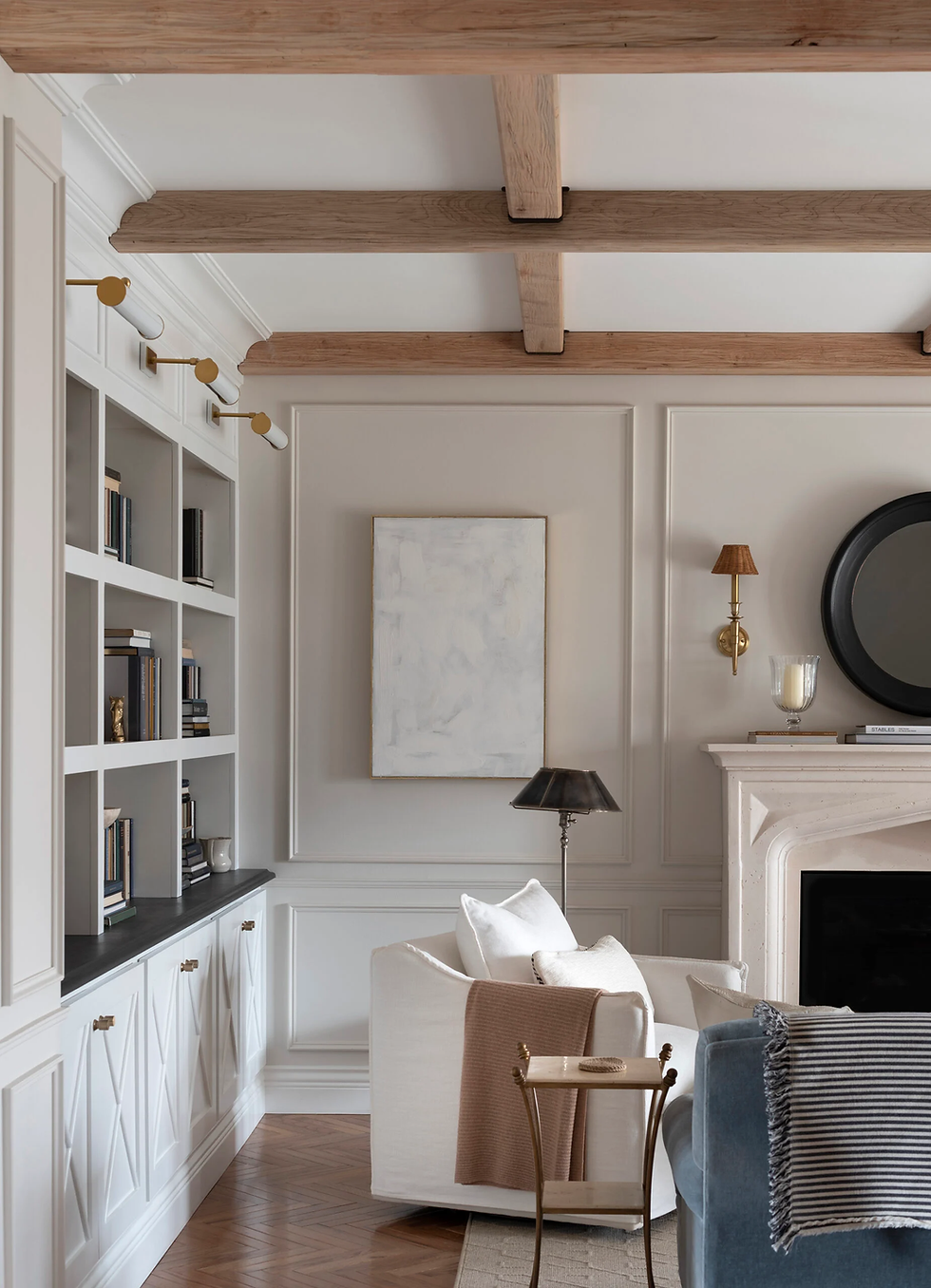
The Living Room

In a harmonious living room, the furniture is scaled to fit the space. A giant sofa in a tiny room breaks harmony. Repeat a color from your throw pillows in the artwork on the opposite wall to "pull" the room together.
The Bedroom
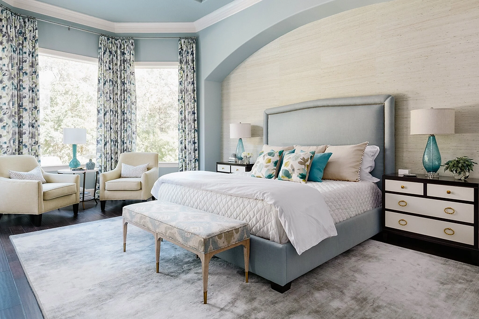
Harmony here is about low contrast. You want soft textures (velvet, cotton) and a palette of cool colors (blues, greens, soft greys). When the textures feel similar to the touch, the room feels like a safe "nest."
The Kitchen
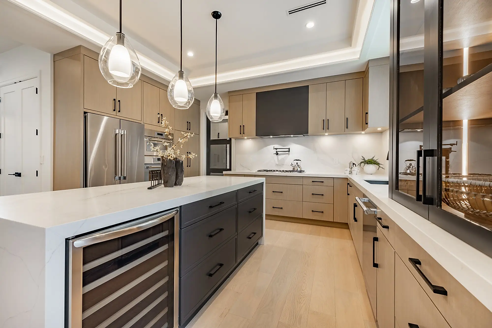
Harmony in the kitchen often comes from the "flow" of materials. If your countertops are white marble, maybe your backsplash has a small hint of grey that matches the veining in the marble. This creates a seamless transition.
6. Common Harmony Mistakes to Avoid
The "Catalog" Look: Buying a matching set where the sofa, coffee table, and side tables are all exactly the same. This is unity, but it’s not harmony—it feels "fake" and boring.
Ignoring Negative Space: Filling every corner with "stuff." Harmony needs "breathing room" (empty space) so the eye can rest.
Too Many Accents: If everything is an "accent," nothing is special. Pick one focal point per room.
Misjudging Scale: Putting a tiny rug under a huge dining table creates a visual "clash" that breaks harmony immediately.
7. Expert Tips to Maintain Harmony Over Time
The "One-In, One-Out" Rule: When you buy a new piece of decor, ask: "Does this share a color or material with what I already have?" If not, something else has to go.
Seasonal Changes: You can change your "10% accent color" for the seasons (e.g., orange pillows in fall, blue in summer) while keeping the 60% and 30% the same to maintain the base harmony.
Lighting Matters: Use bulbs with the same "temperature" (Warm White vs. Cool White). Mixing blue-toned lights with yellow-toned lights in the same room is a fast way to destroy harmony.
The Role of Lighting in Creating Harmony

Lighting is often the "invisible" element of harmony. You can have the perfect furniture and colors, but if the lighting is wrong, the harmony is destroyed.
Color Temperature Harmony
Light bulbs come in different "temperatures" measured in Kelvins.
Warm White (2700K - 3000K): Best for living rooms and bedrooms.
Cool White (4000K - 5000K): Best for kitchens and offices.
The secret to harmony is consistency. If you have one lamp that is very yellow and another that is very blue in the same room, the colors of your furniture will look different depending on which light is hitting them. To maintain harmony, ensure every bulb in a single room has the same Kelvin rating.
Layered Lighting
Harmony is also created through Ambient, Task, and Accent lighting. By having three layers of light, you can control the "mood" of the room throughout the day, ensuring that the emotional harmony stays consistent from morning until night.
9. Why Work with DreamDen for a Harmonious Home?
Achieving harmony is difficult because it requires seeing the "big picture" while focusing on tiny details. At DreamDen, we make this easy:
Global Designers: We assign you an expert who understands the psychology of harmony.
Virtual 3D Renders: You can see if your choices are harmonious before you buy them.
Effective Rates: We help you source materials that work together without the high cost of traditional showrooms.
Installation Support: We can help arrange the final setup to ensure the "flow" is exactly as designed.
FAQs
1. Is harmony the same as matching?
No. Matching is using the exact same item. Harmony is using different items that share a common "soul"—like a similar color, a shared material, or a matching "vibe."
2. Can an eclectic room be harmonious?
Yes! An eclectic room (which mixes many styles) achieves harmony through repetition. You might have a 1920s chair and a 2024 sofa, but if they both have the same velvet fabric, they become harmonious.
3. What is the fastest way to fix a room that feels "chaotic"?
Clear the clutter first. Then, look for the "odd one out"—the item that doesn't share a color or shape with anything else—and remove it or change it.
4. Does harmony make a room look small?
Actually, the opposite is true. Because harmony creates flow, the eye moves smoothly across the room without stopping. This makes a space feel larger and more open.
5. Why is "Visual Weight" important for harmony?
Visual weight is how "heavy" an object looks. A dark navy sofa looks heavier than a light grey one. Harmony requires you to balance these weights so the room doesn't feel like it’s "tipping over."
Conclusion: Harmony is a Feeling
In the end, what does harmony mean in interior design? It means creating a home that supports you. It’s about more than just furniture; it’s about creating a space where the "Wind and Water" (the energy) flow smoothly.
When your home is in harmony, you sleep better, work better, and feel more at peace.
Ready to bring harmony to your home?
Submit your remodel query to DreamDen today. We will assign a global design expert to create a harmonious, 3D vision for your space at the most effective rates in the industry!

Comments